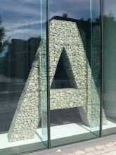
This work investigates typography specifically through the creation of the ‘New Basford’ font family as a way of extending our understanding of text/writing in the urban landscape. It allows the reader/user to interact with the specific location and the typo/graphic data via the language of typography. We have developed a ‘typographic experience’ that will tell both sides of the story—allowing the reader/user to travel ‘within’ the space through their screen, offering a voice to the silent spaces of the territory and yielding new associations. We are inviting the reader/user to utilise the given narratives, but in doing so creating new narratives—retelling stories and reading between the lines. The work offers a further reading of the graffiti writers through typographic intervention, referencing typographic and literary traditions such as concrete poetry and automatic writing, and engaging with some of the most contentious debates on the subject of typography.


To begin to create the typographic terrain of New Basford, the reader/user is presented with two elements: a book and a font family. The book content is traditionally set in justified ITC New Baskerville for continuous reading. It contains the first layer of diverse material sourced from many genres and media comprising of narratives, anecdotes, oral histories, and factual information drawn from newspapers, websites, and books.

The New Basford font family allows you to de-construct the text to form further readings. It engages you to open up a dialogue with the physical space of New Basford in typographic terms. The interaction takes place through the utilisation of the font weights within the New Basford family. One is asked to re-set the original book text using a particular weight, or combination of weights.

The font begins to reveal traces of an alternative narrative, left by the graffiti writers of the area. We explore the terrain virtually, with the font giving access to place. The blank screen becomes a street; the letter becomes a door. Like the street graffiti there is no official system or order that we comprehend, therefore leading us to fragmented words on the screen. The contextual font is pre-text ready, to be cut-up in the manner of Tristan Tzara, all within a low-fi technological approach.

The project was disseminated at two conferences; the Friends of St Bride Annual Conference 2006—Fast Type, Slow Type—and the Writing Landscape symposium organised by Exeter University in 2007. This paper is available here. The above photographs are from the Fast Type, Slow Type conference.


No comments:
Post a Comment