Sunday 6 December 2009

One step forward, two steps back

Designing is a process, and one that is rarely linear, except probably when one writes about the work and edits and structures the piece so that it makes for easier reading—a linear path to follow. The stuff book is ongoing and its latest visual incarnation is evidence of the iterative, non-linear process of design. In this case, it's one step forward, two steps back.

Reflection on the last execution of the work led me to believe that there was too much in the way of typographic intervention interfering with the text, that the visual system for the asides, for example, was more visible than the text itself. Conversely, the attempt to identify subdivisions within stuf by using variations of Lucas de Groot's Thesis did not offer enough contrast for the reader to use in navigational terms. A clear idea of a concept sounding great in theory, but not working out in practice. There also seemed to be too much separation between the different strands of content within the book, and at this stage I was only dealing with two, not the four that need to be integrated in the final piece.

So, I decided a systematic approach might help me. Rather than leaving each page open to containing all or any number of types of content I decided to set some kind of parameter in order to give me something to lean, and perhaps push, against. It's funny how we always think it would be great to do anything we want with a piece of design, but in reality this endless choice of options becomes disempowering and we have to define our own parameters in order to progress.


In this case I decided to try two things. Firstly to give the different types of text very different typographic voices. The academic essay is set in Univers condensed, with a hierarchy developed using headings, sub-headings, pull quotes and references in different sizes and weights; the 'Stuff of dreams' is set in Monotype Modern condensed, a serif face with a bit of personality that I think works well with the tone of voice; memories of things are set, caption-like in Univers bold; and finally, conversations are set in ITC Century codensed italic with a subtle weight change indicating a change in speaker. Secondly I decided to have the 'Stuff of dreams' underpin, literally, the whole piece, by running it almost footer-like across the bottom of each spread using a deep enough leading that the asides could be positioned within the lines.


I thought by delineating this space and defining one consistent element on each spread it would enable me to work with the other elements both more easily and more productively. But no... many things about this decision proved to be wrong... scratch that... many things about this decision enabled me to more clearly see how to progress the piece in a more appropriate direction.


By simply running the text in this space I effectively lost editorial control of the content. It became impossible to engage different types of content productively on each page as the 'Stuff of dreams' was unfolding within a mechanistic system that was unrelated to its content and therefore to the narrative. In a very physical sense it also made a small format somehow even smaller. Not only was there less space free to work in with text it also meant images were constrained in their positioning and could never either fully bleed off the page or simply fill the whole of the text fields. This in turn led to much of the typography falling between two stools—neither expressive and related to the content nor creating an interesting well balanced, asymmetric page layout through good use of the grid and judicious use of white space.

At least the textures of the page showed possibiltites with the use of the different typefaces. One small step forward.


However, what this failed attempt also enabled me to do was to reasess the first attempt. Reflecting on them both together I was able to see more clearly some of the potential for using some of the more expressive earlier designs within a slightly more 'controlled' environment. I'm not sure controlled is quite the right word, but what I mean is that I could see possibilities of creating a book that could hang together visually, show a sense of visual connection through its spreads, but one that generated a rhythm that was not monotonous or predictable. In some ways I guess this is like a collection. Each thing/spread has its own individual features, but it evidently belongs to a bigger set.

Friday 27 November 2009

On Typographic Reference


It is interesting to refer back to the original of this article - published in issue 36 of Emigre in 1995. The thrust of the argument is that...

The oversimplistic positioning of typographic work in relation to Modernism and Postmodernism is not a useful dualism within which to debate, describe or develop.

We need to shift from discussing work in terms of these 'isms' to discussing specific context, intention, etc.

Theory can provide new perspectives - designers need to work with other, more theoretical, disciplines.

Functionalities are multiple, relative and context specific—aesthetics have a part to play in typographic communication—a semiological function. Maybe this means the often trotted out Form v Function is another oversimplistic dualism... (This reminds me of Max Bruinsma's editorial in Eye 32 in 1999)

Looking at the design of the article one can immediately see there are 4 or 5 different voices or elements to the text—body text, references, footnotes, a case study and some occasional sides that are actually quite long, so less of footnote and more of some kind of intertextual/hypertextual linking.

Within this complexity there is a traditional hierarchy evident in terms of headings and sub-headings. The different elements are also clearly defined by use of quite different typeface, size, case and positioning.

So.... I think I need to look at the hierarchy in my piece, possibly something that works for the whole document, rather than something that is different for each piece. Each piece has a different number of potential 'levels'—the academic essay could possibly have five, from title through to references, whereas the conversation has far less of these formal devices—perhaps only two—distinctions between the speakers. I also need to integrate the texts in a constructive/meaningful way—to use the 'montage' to make connections, disruptions, etc—it needs to be content led. Maybe I also need to develop some kind of frontspiece that places the book in some kind of context in relation to contents, methods and aims?

Stuff book in process


Have just put together the first draft of the stuff book. Lots to work on yet though. Format has lost something, I think, and is now a little too big. Think I may need to drop the obsessive Fibonacci based grid in order to give myself more flexibility. The different threads of texts running through the book are also perhaps too separate - there is no productive use of montage in terms of juxtaposing things to make people think or create some kind of 'charge' - at present they exist on separate spreads and use a change from portrait to landscape layout to show very obvious difference.


In order to solve this I think I need to define the voices much more clearly in terms of the typography, before I even think about the layout, so they can interact within the spreads. Maybe I should look at Mermoz's original article On Typographic Reference for some inspiration...

Tuesday 24 November 2009

Excuses at the ready…


Supervision later today and here's a ready made excuse... the cat keeps sitting on my chair in the office, so I can't do any work!

Pecha Kucha night at The Building Exploratory

The lovely folk at The Building Exploratory have invited me to take part in a Pecha Kucha night entitled The Changing Face of Hackney on Thursday 26 November. Pecha Kucha involves a timed Powerpoint presentation of 20 slides of 20 second duration each - I'm not sure I'm known for my succinct summations, so it'll be a challenge!

Sunday 8 November 2009

The 'stuff' of inhuman typography


I am starting to develop work for a series of projects that view place through the lives of objects. A series of three projects will take a micro to macro, or private to public, look at Hackney in relation to objets that are kept, recycled, bought, or sold. The first in the series is the 'close up' view of objects in the home - how we create our own intimate space through the accumulation of significant objects.


This project was inspired by probe pack returns that talked about personal possessions that related to memories, to the process of one's life unfolding over time. These objects can be used to create a kind of 'pause' within one's ongoing life. A chipped blue mug from Berlin is more than that—it is a memory of a time and place, of a shared experience—it enables one to seemingly suspend the daily grind and transport oneself back to a particular moment.


One can perhaps see parallels with the ongoing gentrification and 'regeneration' of parts of Hackney—residents can control the space of their own homes and keep things that nay no longer be functional in a practical sense, but that function in an emotional way. They have less power when it comes to the demolition of the Four Aces Club or the cottages of Roseberry Place.


The content for the project will consist of two, possibly three, aspects—an essay written about 'stuff' (some of which appears in the post dated 9 August 2009), more personal texts and images provided by participants relating to the 'stuff' they referred to in their original answers and possibly a conversation about 'stuff' between myself and one of the participants.


This mix of threads will give me an opportunity to explore the idea of 'montage writing' (Crang & Cook, 2007)—an experimental form of ethnographic writing—within the context of design. The use of extended texts also provides a more realistic test for the geo/graphic design process in terms of the view of geographers and ethnographers who routinely deal with such extended texts and in relation to Mermoz's (1995 on) thoughts with regard to typography. It also offers another opportunity to refute Ingold's (2007) claims about the 'silencing' of the page since the advent of mechanical print.


All well and good, as so often is the way with neatly constructed argument through theory. But, the proof of the pudding, and this PhD is to be found within the practice and I am finding it not nearly so easy to construct such a watertight argument.


The first section I have explored visually is that of the essay The images previous and the next one below) and I am reasonably happy with the interpretation of the text in relation to Mermoz—that the typography should work at the 'level of the text'— and with the way it challenges Ingold's ideas that the page has no voice and is no longer a landscape one can travel.


The layout is constructed using the golden section and uses a 6 pica modular grid to reference the order—or when the text breaks out the grid, the disorder—relating to collections and collectors. The typeface used is Lucas de Groot's Thesis, which comes in a serif, sans and mix version—used to denote the difference between specific collections and generic 'stuff.'

However it is the interpretation of the participants' story (the following images) that I am less happy with. Or at least I am now I have stepped back a little from the screen.


I had a conversation with the work, and as Schön speculated, it talked back to me. Unfortunately it told me I was working in such a way as to be making self referential typographic interventions within the design that related not to the content of the text, but to the system of reading and the 'landscape' of the page.


I may have been trying to take interesting elements from medieval manuscripts, from a time—pre-Gutenberg—when pages were a maze that one had to make their way through, following asides and notations from individual scribes. I may have been accidentally enjoying making work that looks like it fell from the pages of Emigre circa 1992.


But I'm not sure what I was doing was making work that reflected the human story, the real content—work that engaged at the 'level of the text.' It is inhuman typography—it has become perhaps too much about the system and not enough about the person.


So further conversations with the work need to be had, to ensure that the voice of the participant appears within the pages, not just the voice of the designer...

Friday 23 October 2009

Sophie Calle at the Whitechapel

Sophie Calle 'Talking to strangers' opened at the Whitechapel last week. I went twice over the weekend—it is that good (in my humble opinion). Calle's thought processes and methodology have their roots in anthropological work and her repeated concerns seem to be place, memory and identity. The show both inspired me because of these processes (many of which are participatory) and subject matter, but also because of the graphic and typographic nature of the majority of the artefacts on show. There is a huge amount of text, and it comes in all shapes and sizes. From letters, to books, to journal type entries to repeated large visual explorations of the word 'souci', which is French for worry. There is text everywhere. The interesting thing for me was that this isn't just any old text, it is text that has been clearly thought about as part of the process, not just as a by product or afterthought appearing at the end of the project.

Gallery 1 houses 'Take Care of Yourself' (2007) a project inspired by the receipt of an email from her then lover terminating the relationship. Calle has sent the email to 107 other women of a variety of ages and professions—from schoolgirls to mothers, from actresses to psychologists, from rifle shooters to accountants, and so on. The responses cover the gallery wall and are in the form of a photograph of each woman reading the missive alongside their response.


Each response is produced in a very visual, and often typographic way, for example, the rifle shooter has shot through the three instances of the word love and the email is displayed with a small white light sitting behind each of the holes; the children's story writer has interpreted the email in the form of a fable and it has been set as a children's book, complete with appropriate sized text and drop caps at the beginning of each paragraph; and the accountant produced a balance sheet of the relationship. Each of these responses is relevant to the position or role of the participant and to their interpretation of the text. This for me was an incredibly obvious demonstration of the reality of Barthes' notion of the 'death of the author' and the 'birth of the reader'. The words only became truly active through the reading of the text, and they acted in 107 different ways as each person brought their own set of experiences—personal, professional and cultural—to bear on the text. For example, the linguist highlighted the fact that the email began 'sophie', not 'dear sophie' or 'hello sophie', just 'sophie'. This, from a British perspective, was interpreted as a curt, somewhat sharp, opening gambit—one which the linguist wasn't sure would be read the same way in its original language. If anyone is reading this who has also read my recent post on the PhD design list that included comments about tone of voice, it was probably this tactic of starting emails 'Alison...' that I was referring to—it definitely makes me sit up straight and adopt a defensive position. But that is an aside... There is much more to say about this work I am sure, but go and see it for yourself.

A couple of other projects that really caught my eye dealt with absence and presence in terms of place and memory. Projects in Berlin and the Bronx inspired by residents' responses to place—in Berlin to symbols of East Germany that had been removed but that were still present in the minds of the community.


In the Bronx sites of personal meaning that people chose to take Calle to are documented with the execution of image and text done in what might be considered as a traditional field note diary form—images of the people at their place of choice alongside notes of their reasons for taking Calle there, their memories and notes of the exchange between the artist and participant itself.


This style is repeated in The Gotham Handbook (1998), another fantastic idea, that I don't have time to talk about here. But I wonder whether the move away from this traditional form of representation to a more expressive use of text was triggered by a realisation of the potential of text in the work or a simply a desire to escape the repetitive nature of the visual 'capturing' of the projects. I am not familiar enough with Calle's work to know her position on whether the work in the gallery is the 'art' or whether the engagement with people and place is the real art. It brings to mind the contrast with the work of Richard Long—another in the queue of blog posts awaiting to be made—who seems to have a very clear 'formula' for his use of text and image in the communicating of his walks. A bit more reading is in order to find this out...

I think one of the things that also caught my eye, and it perhaps links to this idea of Long's 'formula', was how strict Calle was about setting her guidelines and how short, in terms of time, some of the experiences were. For example in the Gotham City Handbook, often her observation of the phone box would last only 1 hour, during which a huge amount of things happened. I guess when one is dealing with the minutiae of the everyday even five minutes can provide meaningful encounters.

Lastly, in response to my own thinking about my practice submission, it was interesting to see how a range of projects came together under one roof, and functioned both as separate entities, but also contributed to the whole. There are definitely obvious central themes that are being explored, even though they are some differences in methodology and execution. This is something that I need to think about right now, and perhaps I could nail my themes as the 4 Ps: Place, page, process and pause.

Monday 19 October 2009

Drains and chewing gum


I noticed this drain and the rather nice yellow line and number 12 as I walked out of Walthamstow tube station a couple of weeks ago. Actually what I noticed most was the huge number of grey blobs to the right of the drain - the remains of chewing gum. I am wondering two things... presumably the chewers were aiming to pitch their gum into the drain, so are all chewers of gum in Walthamstow really bad shots and, perhaps more seriously, why on earth do they think it is ok to chuck their chewing gum in the drain anyway? Morons.

Wednesday 7 October 2009

The Muriel Lake Incident (1999), Cardiff & Miller

About ten years ago I saw what I now know to be The Muriel Lake Incident by Janet Cardiff and George Bures Miller at Tate Modern.


The memory of it (unlike the name) stayed with me. A few months ago I did Janet Cardiff's audio walk The Missing Voice (case study B) from Whitechapel Art Gallery. Not only did I put two and two together and remember the work from the Tate all those years ago, but I also got a bit carried away and wrote shed loads about the walk in my thesis draft. Honestly, go and do it, it really is great.


Now clearly I am interested in exploring place through the medium of print not sound, so my enthusiastic writing has since been cut, but I still think there are some useful parallels and differences that could be worth exploring both theoretically and practically. Having now read the essays in Janet Cardiff & George Bures Miller: The Killing Machine and other stories 1995-2007, I can even articulate what some of those things might be. The walks engage one via a 'soundtrack' that has both real and 'artificially' constructed elements, blurring the distinction between the world outside and within the headphones. By following the 'score' (as in music not football) the walker becomes a participant, rather than a spectator, acting out or performing the walk and realising its potential. In the book, Mari (p 15-16) puts the roots of this type of work in the Fluxus movement.

So how does this relate to my work? In order to translate the experience of place into print one will need to engage the reader in a pro-active, interactive way. There needs to be an element of the reader taking control, and literally taking a journey through the work (and therefore the place) themselves. In effect the reader (to get into Barthesian territory) needs to become the author in the way that in Cardiff's work the spectator becomes the actor. What I think will differ from Cardiff's work is how that is scored, scripted or dictated. The idea of a score implies something that is written down and has very clear parameters in terms of timing and execution. Even with the possibility of interpretation through a conductor, this seems too fixed for what I am trying to achieve. Cardiff's walk is very clearly scripted. One literally follows the pace of the footsteps on the recording and the verbal directions as to where to cross, where to turn right, and so on, and really it could be no other way or the narrative would not work. However, my work needs to encourage greater exploration of place. The parameters need to be wider. If its music, perhaps it is a riff that is then explored in a more freeform way? What a revolting analogy, but do you see what I mean? How one does this I don't know, though I am pretty sure one can experiment physically with the form of a book to speed up/slow down the reader. I was thinking of flicking through the pages of a magazine as being like getting from A-B in the fastest way possible, disinterested in twists and turns that are off route. Could it be possible to slow people down, or encourage them to explore via the design? I think it could, so I need to explore these ideas physically AND STOP JUST TALKING ABOUT THEM!

Monday 5 October 2009

Well St 1


Well St 1
Originally uploaded by abarnes4

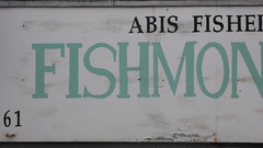
Just uploaded a new batch of Hackney shots - mostly of a typographic nature.

Wednesday 23 September 2009

Back home, books and lots to do...

After 14 lunches of greek salad and 10 dinners of briam I am home. Sad to feel the slight autumnal chill and depressed at the thought that I am entering what, come November, should be my final year. It remains to be seen. Right now, I can't imagine that I could get everything done by then. Its a funny old process the full time PhD. Very much a rollercoaster and very much a lonely furrow to be ploughed. I did read a couple of books whilst away. Johanna Drucker's The visible word which I hate to say that I found a bit turgid in its theoretical discussions - too many long words. Maybe it was the fact that I was lying on a beach, but why say 'quotidian' when one can say 'everyday'. If it hadn't have been for that supposedly French takeaway at St Pancras I wouldn't have known what she was on about. It's good to be specific, but even better not to be exclusive.

The other thing I read was a journal type publication by Black Dog, edited by Alex Coles, Site-specificity: The ethnographic turn. I really enjoyed the first half of this - essays by ethnographers about site specific art and by artists about their practice drawing on ethnographic methods. One essay on Sophie Calle's work even had me making notes in my mobile phone about things that could relate to aspects of my work. The note says 'The gift - Mauss - freecycle is kind of gift giving... Diff community not 'small worlds of personal relationships' online changes gift giving?' What on earth was I going on about? Sunstroke maybe? What I think I was getting at was related to the ever burgeoning series of 'stuff' projects. I have begun to use freecycle and have subscribed to the Hackney Freecycle group's daily digest - I foresee a 'stuff' project coming from this 'data', alongside another about Newsagent's windows, but that's another post entirely. But theoretically I think I was making links with the type of online society/community/personal relationships brought about by social networking and such like and how this might impact on theories like 'the gift'. Not that I know much about it, bar what I read in this article. However, apparently 'recent anthropological theories of gifting illuminate the very idea of there being part-societies (moral economies) that typically consist of small worlds of personal relationships that are the emotional core of every individual's social experience.' (Kuchler 2000:103) Hmmm. Need to read more about this but I guess I was getting at the fact that online stuff enlarges these 'small worlds' and therefore enables us to exchange with a much wider range of people - Facebook is full of nonsensical gift giving applications - there's probably someone researching this very thing right now. I'm not sure if Freecycle can be shoe-horned into this idea as it doesn't seem that altruism comes into the original equation. However, things are still 'given', and often are given in terms of something being posted as 'wanted', rather than just being taken on a whim. More reading maybe, but then again, with only a year to go, I should watch out for brightly lit, tangential culdesacs...

Tuesday 25 August 2009

Flickr account

I now have a Flickr account where I am in the process of unploading and geo-tagging all my Hackney photos.

Letterpress posters - sneak preview

The letterpress posters I have been working on for the HTAP in/flux exhibition are based on snatches of overheard conversations within Hackney. The conceptual overview touches on the following...

Massey (1994, 2005) defines place as process, as something that is open, not static. For Massey, place is…

…the sphere of a dynamic simultaneity, constantly disconnected by new arrivals, constantly waiting to be determined (and therefore always undetermined) by the construction of new relations. It is always being made and always therefore, in a sense, unfinished…
(Massey 2005:107)


To me, this has resonance with Hackney and the idea of ‘transience’ as proposed by HTAP—Hackney is a space filled with converging and diverging multi-linear narratives.


Conversely, Tuan (1977:6), writing from an earlier Humanistic perspective, likens space to movement and place to pauses—the pauses enable us to know place better and inscribe our own meanings and value onto it, to become ‘rooted’ in place and to develop a ‘sense of place’ (Tuan 1977:198).


Walking through the streets of Hackney one overhears snatches of people’s conversations, and can gain a momentary window into their lives. By using traditional letterpress, a very time consuming, laborious process, to visualise these narrative fragments the work attempts to ‘freeze-frame’ that moment, to pause within the process.


The use of typeface, size, colour and positioning draws the viewer into the recreated moment, enabling them to engage with the fragment of conversation and construct their own narrative about the situation or the speaker. The series as a whole also attempts to reflect the diverse nature of Hackney and its residents.


I am wondering...

I have been trekking through Elephant and Castle underpass, from the old tube exit to LCC, on and off for the best part of 8 years and only this week did I notice that the number 1s stencilled onto the pavement along sections 12 and 10 are either upside down or back to front. Does that make me unobservant or just a bit of a weirdo for noticing at all?


Monday 17 August 2009

HTAP at Hackney Wicked, 1st August 2009

As part of my association with HTAP I was part of Pattern Making For Beginners held on Saturday 1 August at the Red House, behind the Counter Cafe. The event was described as a research and collection day that was primarily executed via a diverse range of mapping type tools. My contributions were a Type Cast Map and a Secrets Map.

The Type Cast Map follows on from my earlier work regarding place image and the Hackney Gazette headlines. Here I invited people to describe Hackney in general, or a particular part of it, in their own words. I then printed these words onto a map of Hackney using woodblock type and a basic ink pad, thus creating a landscape of text. People's responses ranged from the personal to the political, but the majority of the responses, unlike those of the Hackney Gazette, were of a positive nature. The three photographs below show the map in action at the festival.


The Secrets Map was an installation comprising a framed map behind a black curtain and a shelf with cards, envelopes and a wooden box. Participants were invited to share a secret that related to somewhere in Hackney, fill this in on a card, seal the card in an envelope and place it in the box. They were then asked to locate the secret by placing a red cross on the map of Hackney behind the curtain. The only elements included on the map were icons for Mosques, Churches and Synagogues—these, and the black curtain, hint at something of a confessional type experience. The three photos below show the map in action and a close up of its use.


I intend to develop this project further, by locating the site of the secret, gathering visual and other types of evidence, and speculating on the nature of the confession.